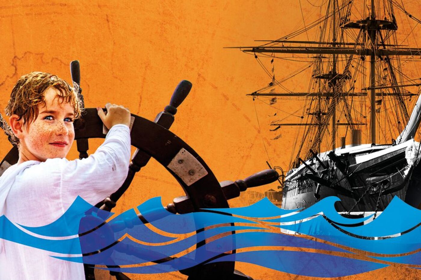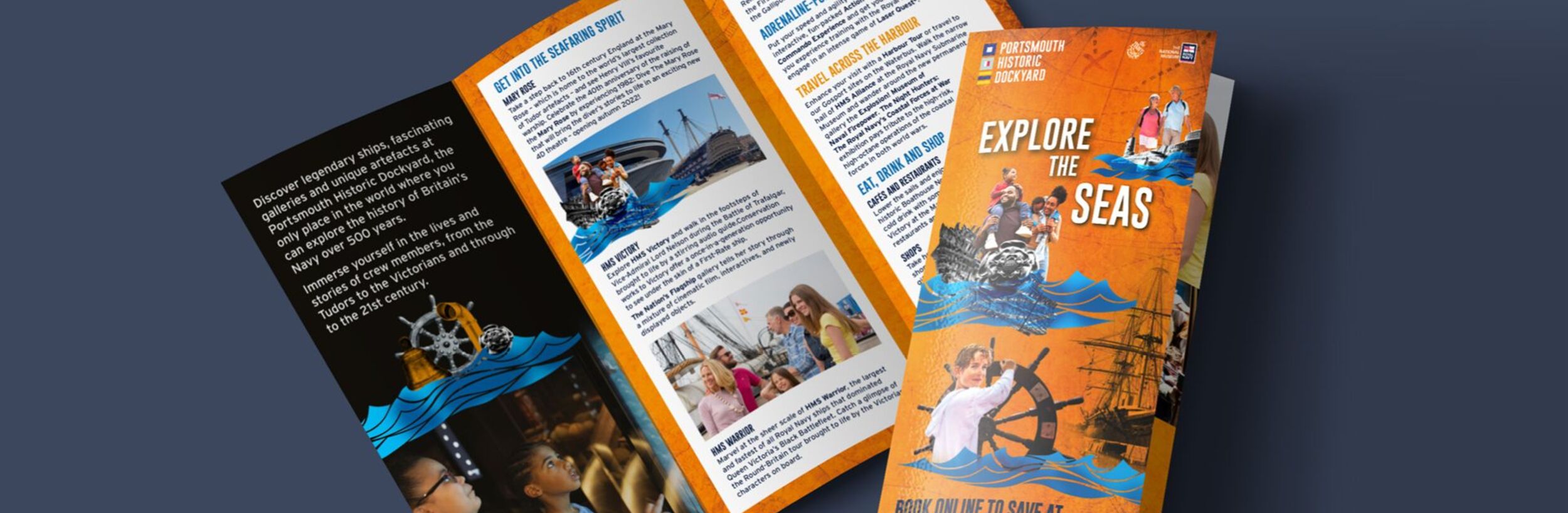
It was important to create a sense of place using various textures and objects from the attractions as well as including a diversity of people featured in the campaign to appeal to a variety of audiences. We used a bright orange from the brand's colour palette to tie the campaign to Summer and create a fun uplifting feel, this also provided a connection with the previous campaigns.
The layout allowed us lots of flexibility as we could pull apart the various wave sections to fit different assets from bus sides, posters, digital banners, and DL leaflets. It also acts as a great tool in which different attractions and objects can be held within. The theme of ‘Become the Ultimate Explorer!” was updated from the Spring campaign to “Explore the seas this Summer”, still tying in but also creating more excitement about being on-site.