
We decided to simplify down the current flags so they just stood for the brand initials PHD, this also allowed the mark to become more condensed and easier to use on a variety of applications, as well as being more legible at a smaller scale.
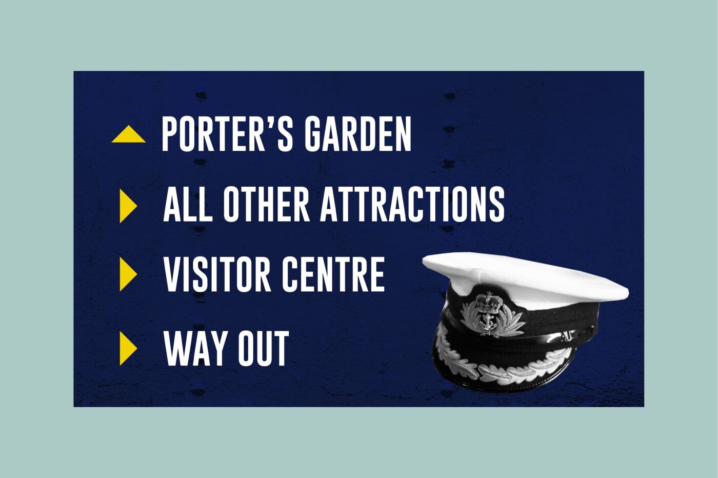
Colour was an important factor, as we wanted to create a fresh feel and expand the palette to allow for more creative use due to the breadth of what was on offer on site. We tailored this alongside cutout imagery and textures to engage the audience and create an inviting atmosphere for all
The brand refresh fitted in nicely with the reopening of site after the COVID-19 lockdown of such attractions. We created a campaign that created a safe and exciting feel to them opening again with the use of a montage alongside some fun and approachable copywriting. This was rolled out across a variety of print and digital applications. As well as the launch campaign we also created a set of brand guidelines, on site signage and a style for further campaigns and events.


